Using jupyter & Plotly to create benchmark visualisation
Using jupyter & Plotly to create benchmark visualisation
Performance is important or readable & maintainable important, I think different devotee has different answer. But benchmark is an insteresting topic for every developer, because benchmark can help us getting high performance and readable either.
What's benchmark, there is explanation from wikipedia:
In computing, a benchmark is the act of running a computer program, a set of programs, or other operations, in order to assess the relative performance of an object, normally by running a number of standard tests and trials against it.[1] The term 'benchmark' is also mostly utilized for the purposes of elaborately designed benchmarking programs themselves.
Whatever it's for function benchmark or http server benchmark. We are looking forward to get better solution to resolve the problem. I use a bunch of benchmark tools, I'm going to write a series blog for each tool. For now I just recommand some useful tools:
- jmh java official benchmark tool.
- Benchmark.js javascript/nodejs benchmark tool。
- benchpress angular official e2e performance tool, this is my fevourite frontend performance tool, because it's not only for angular app but also can be used for other frontend app.
- perf-tools linux benchmark tool, basically for every programming language.
- ab apache http server benchmark tool。
- hey go-lang implemented http server benchmark tool。
Beside benchpress, all are command line tools, so we have to find a way to make benchmark data visualisation. I found out Plotly.js, it's a very good javascript library to generate chart. it also has a lot API to support other programming languages, such as scala, python, R…see there. I like python API, because can use with jupyter.
installation: (assuming you already have jupyter)
$ pip install plotly
After that you need to create a Plotly free account, free account can store 25 charts and then you need initialize your Plotly account in jupyter with your account name and api_key(your api key is in settings)
import plotly
plotly.tools.set_credentials_file(username='account', api_key='api_key')
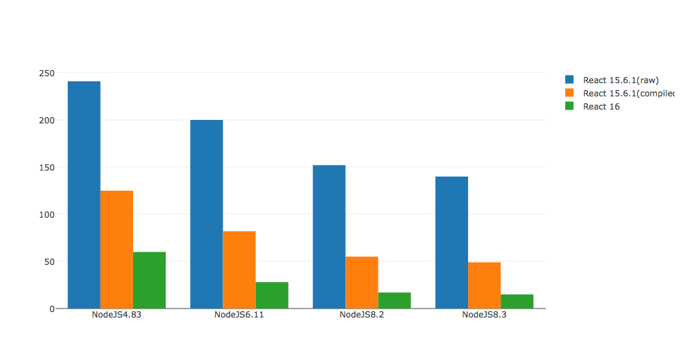
Now we can make benchmark visualisation chart, I use an reactjs benchmark project for that showcase.
Actually react-16-ssr-perf uses different benchmark chart, it also looks very nice. But I don't know whether it's convenience as python plotly :)
import plotly.plotly as py
import plotly.graph_objs as go
from plotly.graph_objs import *
'''
I only need to provide different benchmark categories, Plotly can help to generate a beauty chart for me!
'''
react15Raw = go.Bar(
    x=['NodeJS4.83', 'NodeJS6.11', 'NodeJS8.2', 'NodeJS8.3'],
    y=[241, 200, 152, 140],
    name='React 15.6.1(raw)'
)
react15Compiled = go.Bar(
    x=['NodeJS4.83', 'NodeJS6.11', 'NodeJS8.2', 'NodeJS8.3'],
    y=[125, 82, 55, 49],
    name='React 15.6.1(compiled)'
)
react16 = go.Bar(
    x=['NodeJS4.83', 'NodeJS6.11', 'NodeJS8.2', 'NodeJS8.3'],
    y=[60, 28, 17, 15],
    name='React 16'
)
data = [react15Raw, react15Compiled, react16]
layout = go.Layout(
    barmode='group'
)
fig = go.Figure(data=data, layout=layout)
py.iplot(fig, filename='grouped-bar')