使用jupyter和Plotly创建可视化benchmark图表
使用jupyter和Plotly创建性能分析图
编程到底是性能更重要还是可读、可维护更重要,我想不同语言的拥护者各有答案。但是基准测试对于所有语言的使用者来讲都是个有趣的话题,因为基准测试可以帮助我们写出即可读、可维护又相对高性能的代码。为什么是又呢,性能真的是一个只能相对的概念吧 :)
什么是基准测试呢, 这是wikipedia的解释:
In computing, a benchmark is the act of running a computer program, a set of programs, or other operations, in order to assess the relative performance of an object, normally by running a number of standard tests and trials against it.[1] The term 'benchmark' is also mostly utilized for the purposes of elaborately designed benchmarking programs themselves.
其实不管是专注于function的benchmark,还是http server的benchmark都是希望借助基准测试找到更优的实现方式。我用过的基准测试工具不多,之后打算把每一个工具写一个文章记录一下。这里列举一些,也算是一个推荐:
- jmh java的官方benchmark工具,在有了jshell之后这个工具使用起来应该会更方便一些了,甚至不需要继承到项目里面。
- Benchmark.js javascript/nodejs的benchmark工具。
- benchpress angular官方的e2e performance工具,这个是我非常喜欢的前端performance工具了,其实不只是可以用来测试angular app,因为它是基于h5 performance API的工具,所以可以用在任何前端项目上。
- perf-tools linux下的benchmark工具,基本可以用来对任何语言进行基准测试。
- ab apache http server benchmark tool。
- hey go语言实现的http server benchmark tool。
这些工具,除了benchpress其他都是命令行工具,都没有办法生成可视化图表,所以我一直想找一个能把benchmark的分析数据可视化的好办法。于是乎我就找到了Plotly.js,没错这是一个前端库,但是他提供了众多其他编程语言的集成API,具体可以看这里。我最喜欢的python的API,可以非常方便的和jupyter一起使用。
$ pip install plotly
之后需要在Plotly创建一个free account,免费账号可以保存25张图表。其实只要定期删除不用的chart,基本已经够用了。
注册之后需要在jupyter里面设置你的account和api_key(在settings里面可以看到)
import plotly
plotly.tools.set_credentials_file(username='用户名', api_key='api_key')
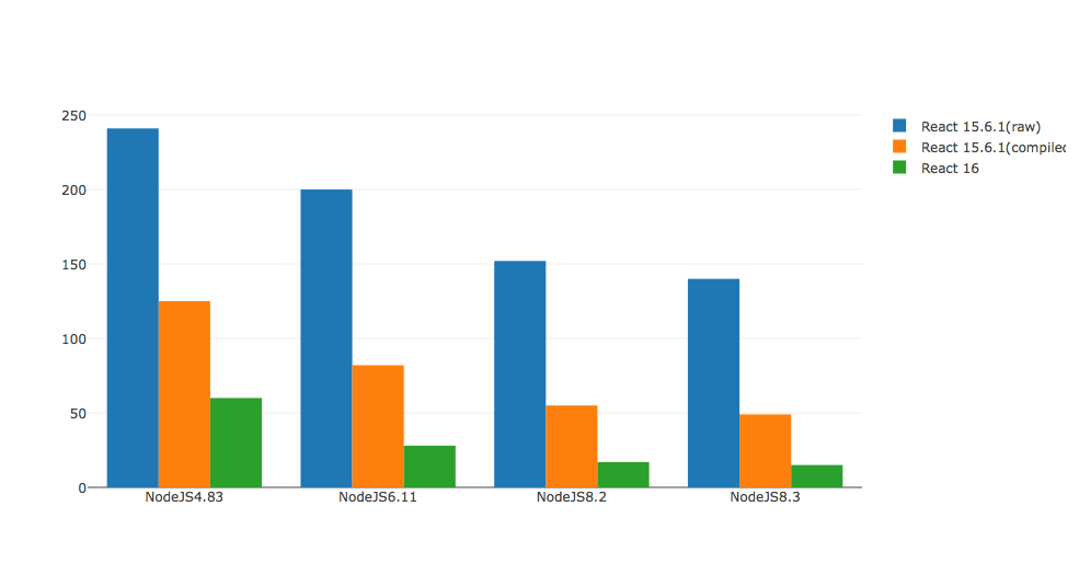
下面就来创建一个benchmark图表试一下,我找了一个reacjs benchmark项目,这个项目并不是我的,算是借花献佛。
react-16-ssr-perf这个项目的作者用的chart好像和我找到的并不一样,但是没关系大家想要达到的目的是一样的。
import plotly.plotly as py
import plotly.graph_objs as go
from plotly.graph_objs import *
react15Raw = go.Bar(
    x=['NodeJS4.83', 'NodeJS6.11', 'NodeJS8.2', 'NodeJS8.3'],
    y=[241, 200, 152, 140],
    name='React 15.6.1(raw)'
)
react15Compiled = go.Bar(
    x=['NodeJS4.83', 'NodeJS6.11', 'NodeJS8.2', 'NodeJS8.3'],
    y=[125, 82, 55, 49],
    name='React 15.6.1(compiled)'
)
react16 = go.Bar(
    x=['NodeJS4.83', 'NodeJS6.11', 'NodeJS8.2', 'NodeJS8.3'],
    y=[60, 28, 17, 15],
    name='React 16'
)
data = [react15Raw, react15Compiled, react16]
layout = go.Layout(
    barmode='group'
)
fig = go.Figure(data=data, layout=layout)
py.iplot(fig, filename='grouped-bar')